Which would you say was more vital to your holiday rental website – the images or the words you write?
Well in fact it’s a bit of a trick question since they’re both equally as important as each other.
Imagine you were looking to book your next holiday. If you came across a website with no images of the property, you wouldn’t be able to form an opinion of the place and certainly wouldn’t be able to decide if you wanted to stay there or not. So you’d most likely would move on, right?
No matter how good the words were or how descriptive they were, it wouldn’t be enough.
Now let’s think about it from the other side of the coin – the idea of having lots of images on your website, but no words.
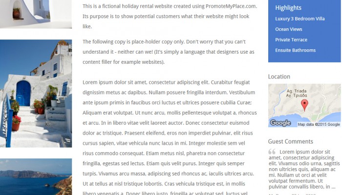
Here we can see what the holiday rental looks like and we probably have a great idea of the local area too. But even if there was a snap of every single room, we’d most likely have some additional questions too – such as is there Wi-Fi!
So one needs the other.
Text and photos.
The trick is to get the balance right to provide the most comprehensive website for your potential guests that encourages them to make a booking.
Getting the balance right on each page
You might think you have the balance between words and pictures just right overall, but does each individual page tick the box?
Regardless of the page’s content, you should always try to add a visual element, with the exception of the Rates, Availability and Contact pages. The latter being particularly important since you don’t want to distract from the ultimate aim of that page – to receive an enquiry.
But aside from those pages, you have an opportunity to add a photo or two to enhance the overall impression it gives your website visitors.
Which pages are more successful in terms of visits?
A useful metric to factor in is the number of visitors each page of your website is receiving and how long they’re sticking around.
This may help you figure out whether a particular balance of words and photos is working better than others. If you feel it is, you could adjust the balance on other pages to see if traffic improves there as well.
Even the odd tweak here and there can make a real difference.
A learning curve
It’s a pity there’s no formula you can use to work out whether you have the right combination in place or not.
However, the more you assess the balance between words and photos, the easier it will be to tell what works, and what doesn’t.
Certainly, an informative home page with eye-catching featured image (or slideshow of images) will do a lot to draw people in. The words you use to describe it and the local area, will be what ensures people stick around to find out more.
If you’ve never thought about striking a balance between the two elements before, what are you waiting for?
Take a look at your site with a critical eye. What could be made more visually appealing? What could be more descriptive? What will entice your website visitors to stay, read and make an enquiry?
If some pages are too text-heavy, or some too photo-heavy, balance it up to give just the right amount of information between the two.
Leave a Reply