It’s hard to get attention on Pinterest, right?
You’re up against a lot of competition.
So you may wonder why other holiday let properties get their photos re-pinned time and time again, while yours don’t seem to get any traction at all.
Of course there could be lots of different reasons behind it, but here’s one solution you might want to try – add more colour.
Colour is an important element in many photos.
It may not be the most important one, or even the only element that matters. However it does have a lot to offer.
If you’re not a natural photographer, colour can step in where you don’t have the skills to achieve more from the actual shot.
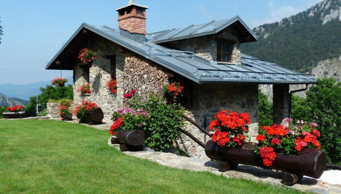
Colour in contrast
Contrasting colours can work really well.
One recent example that popped out when taking a look through Pinterest, was a shot of a bright red geranium planted next to a lime green-leafed plant in a grey pot.
The combination of the green and red worked brilliantly, and the image stood out way beyond anything else on the page.
Red and green are great colours to use, but any contrasting shades or colours would also work.
Take a look around your holiday rental to see what contrasts you can find – both indoors and out.
And don’t forget you can dress an area specifically for that Pinterest upload – making it more unusual or fun to achieve that stand-out effect.
As bright as you like!
Bright colours catch the eye, there’s no doubt about it. So why not try going bright to attract the attention of more people on Pinterest?
If you don’t believe it, check out pictures in any category on Pinterest.
You’ll notice the ones that tend to jump out at you are more colourful than the rest. Not always, but there’s a good chance your holiday let photos will be noticed if they’ve got brighter colours in them.
The more attention you can get through brighter colours, the more chance you have of those images being re-pinned more often.
Look for a bright colour that stands out against an otherwise-ordinary background
You don’t need lots of colour to make a splash and catch peoples’ eyes, instead, just a tiny splash in the right place can achieve what you’re after.
Maybe the living room of your holiday rental is resplendent in lots of neutral and natural colours. Why not add a couple of bright blue cushions to the sofa to provide that essential splash? Or how about a red throw on the back of the sofa?
Don’t discount flowers either.
A neutral-coloured kitchen can be really calming and appealing, but it may not easily be spotted on Pinterest. So, add a vase of sunflowers to the scene and take a picture that includes the vase as well.
You might be surprised at how much more the photo ‘pops’ as a result.
So here’s what you should do before adding photos to Pinterest:
- Add colour
- Add brighter colours!
- Go for contrasting shades
- Inject a splash of colour to neutral rooms
Thinking of uploading a photo to Pinterest?
Take a second to check it’s appeal. Will it stand out? If not, take the photo again and then upload.
Leave a Reply