 We’ve released a fantastic new update to PromoteMyPlace that allows you to choose whether a mobile friendly version of your website is automatically shown if browsed using a mobile device.
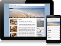
With the growing number of people using smart phones to access the internet, more and more people are viewing your website on mobile devices. The limited screen size of these devices often makes it difficult to navigate around your website and read the content, without zooming in and out and scrolling sideways. This makes for a poor user experience.
What’s more, people are likely to spend far less time browsing your website on a mobile device than they will on a laptop or desktop PC, so it’s important to allow them to get to the information they need as quickly and easily as possible. This is what our mobile friendly display format does!
When you switch on the “Mobile Friendly Display” for your website it will automatically display a mobile optimised version of your website when accessed on a mobile device. This version has mobile friendly navigation and has been cut down to include just the necessary information, dramatically improving the mobile user experience.
To switch on the “Mobile Friendly Display” simply login to your PromoteMyPlace account, go to section 9. Mobile Display Settings and tick the box “Enable Mobile Friendly Display”. That’s all that’s required!
Now head on over to your mobile phone and see how your website looks!
Really pleased with this extra feature. Our site loads quickly and is very easy to navigate on a phone. Plus you’ve thought of everything – users have the option to select the non-mobile version if they wish.
Thanks!
You’re welcome Nikki! Thanks for taking the time to leave your feedback. We’re delighted your pleased with it!
A great addition which is really important for all serious rental hosts now that some 30% of people browse rentals on their smart phones. Good work PMP!
Thanks Damian.